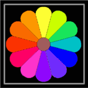
Using A Color WheelColor wheels do not exist in nature, but are useful in describing the visual relationships between colors.Note: The colors shown here are not exact. |
 |
"Color warmth"- This quality exists only in comparison with other colors. Yellows and oranges are generally considered the warmest (most like sunlight). Blues and blue violets usually appear cooler.
Neutral colors- Technically, black, white and gray are not considered colors; practically, they are useful and necessary colors. If our pigments and dyes were perfect colors, you could mix black by combining the three primary colors. Since they are not, you will usually get some variation of dark gray or brown depending on the pigments used. Gray that has a slight color bias is often more interesting and useful than a neutral gray.
Primary colors- In working with paints and dyes, red, yellow, and blue (or cyan, yellow, and magenta) are the only three colors that can not be mixed by combining two other pigments.
Secondary colors- Orange, Green, and Violet are created by mixtures of two primaries. Both the relative amount and strength of the dyes will affect the color bias of the results--e.g. yellow orange or red orange.
Complementary colors- Any two colors opposite each other on the color wheel. Red/Green; Orange/Blue; Yellow/Violet; Blue-green/Red-orange, etc.
Analogous colors- any 3-4 colors adjacent to each other--Orange, red-orange, red, red-violet. Red is their common component; blue is minimal or not included.
Monochromatic- Variations of one color--tints, tones, shades; hue variations may also be used.
Triad- Three colors an equal distance apart on the wheel. Exciting color combinations may be discovered when the colors used are not exactly equidistant--a "skewed" triad.Using at least one color in a less saturated version makes a more interesting triad.
Primary Colors for Dyeing
A warm, slightly orange red
A warm, greenish blue
A cool, slightly reddish blue
A cool, slightly green-ish yellow
A warm, slightly orange-ish yellow
When deciding what dye color to use to make clear colors, you must think of the color bias of each dye color and avoid the combinations that include a bit of the third primary. For example, Turquoise and lemon yellow make brilliant greens, but substituting either a a reddish yellow or a reddish blue will add the third primary and dull the results.
Magenta and lemon yellow make slightly dull oranges because they both contain a bit of blue, while a golden yellow and a warm red will give brilliant oranges.
Magenta and Turquoise or Scarlet and Turquoise will make dull violets, because there is a bit of the third primary--yellow-- in both combinations.
However, any reddish, yellow or blue dye color can serve as a primary when mixing dye.. The results will include a variety of slightly grayed colors, depending on the color bias and purity of the dye colors you combined.
Experiment! Combine a warm, red brown with a cool, reddish blue, or a golden yellow with cool, reddish blue, or yellow with a cool black (one with blue undertones).
Three Color "Rules" to Remember
- Quilts should include some "grays" (i.e. some "tones" or more or less subdued colors; light and/or dark).
- If the values are right, the colors will work (even when they are wildly "unrealistic".) See the horse paintings of German Expressionist painter, Franz Marc
- Small amounts of cleaner, brighter and warmer colors will give a quilt sparkle; small amounts of cleaner, cooler colors in the shadows will add vibrancy to your colors.
Suggestion: Use one of your colors in purer, cleaner form--pure and/or tints--and the others in more or less subdued or grayed tones and shades. Brown, for example, is a shade (or tone, depending on value) of orange (a variety of oranges, actually), beige and tan are tones of orange, while peach is more of a tint. Combine these with almost any other colors on the wheel.
©1999 Lily M. Kerns (You may copy and distribute this freely if this notice is left in place.)